Data Visualisation, Big data, Algorithm cultural, Cultural Analysis, Software studies
by Marcio Emilio dos Santos and Cicero Inacio da Silva
1. Introduction
This article addresses the use of computational resources to build advanced visualisation systems in the digital humanities field, following the theoretical approach created by Lev Manovich, mainly demonstrated in his new work, “Cultural Analytics”. The Software Studies Lab at the Federal University of Juiz de Fora (UFJF) has partnered with the Software Studies Initiative Lab, coordinated by Lev Manovich and Jeremy Douglass, based at CALIT2 (California Institute for Telecommunication and Information Technology) and at CUNY Graduate center, in order to develop projects on the data visualisation field. The content that this article presents and discusses is the result of a one year research project on the visualisation of the entire collection of covers of the Veja magazine, considered the most important weekly magazine in Brazil. The analysis that we demonstrate was performed over 44 years of the Veja magazine publication. This magazine was created in September of 1968, during the military dictatorship in Brazil. Over the years the magazine has represented political moments and social and economic growth, passing through the period of political openness, covering the direct election of the first civilian president after 30 years of military dictatorship, his impeachment, economic rise and stabilisation, election of the first president coming from the working class, until the election of the first female president, the current President Dilma Rousseff.
Visualisation theory can be divided into two basic classes: scientific visualisation and information visualisation. The information visualisation system has been improved to offer new tools that shift the predominance of cognitive modalities for mathematic representation, i.e. based on simple methods of image models to complex systems of visual information based in lines, charts, drawings and interactive tools. On the other hand, scientific visualisation systems based on digital tools can amplify the level of abstraction and complexity for the researchers in order to improve the meaning of relevant aspects of a search based on an algorithmic model of an image. The other approach is based on mathematical or graphical representations operated by geometric primitives that can present the content directly and relate it to a complex context based on a visual description of the image itself. In the design of our project, when we decided to apply to the system measurements of colour saturation on the entire set of covers of Veja magazine, for example, the outcome could have been a traditional chart that showed the prevalence of this topic, such as a gradient. However, using the visualisation method of analysis, the result was built with the image of the covers. Over it we applied a mapping context with the elements themselves appearing over the images, creating a visual perception of the entire set, and at the same time the researcher can see the gradient, saturation, colours and other aspects of the set of covers.
Comparing the set of images we can see a gradual movement from the numerical representation (based on tables) to a graphical representation based on geometric primitives (the line graph) and finally the representation based on a visual map which contains data analysis of the images that were arranged according to the results of the measurements of the objects represented in the set of covers. The information visualisation shows the axis of a representation of geometric primitives into a direct representation of mapped objects that creates the need for a use of special devices (usually an array of screens) for viewing large image formats. This necessity is because each element (a cover scanned in 380×490 pixels) occupies a relatively large space if we use a default page size A4 paper or a computer screen. For this reason, the visualisation technology is becoming more popular. By allowing studies that are not restricted to a single display window screen, but that are increasingly promoting the use of a large amount of tiles (usually forming an array with more than 4 screens), the systems are significantly improving the visualisation characteristics of the results of research in a large array of academic fields.
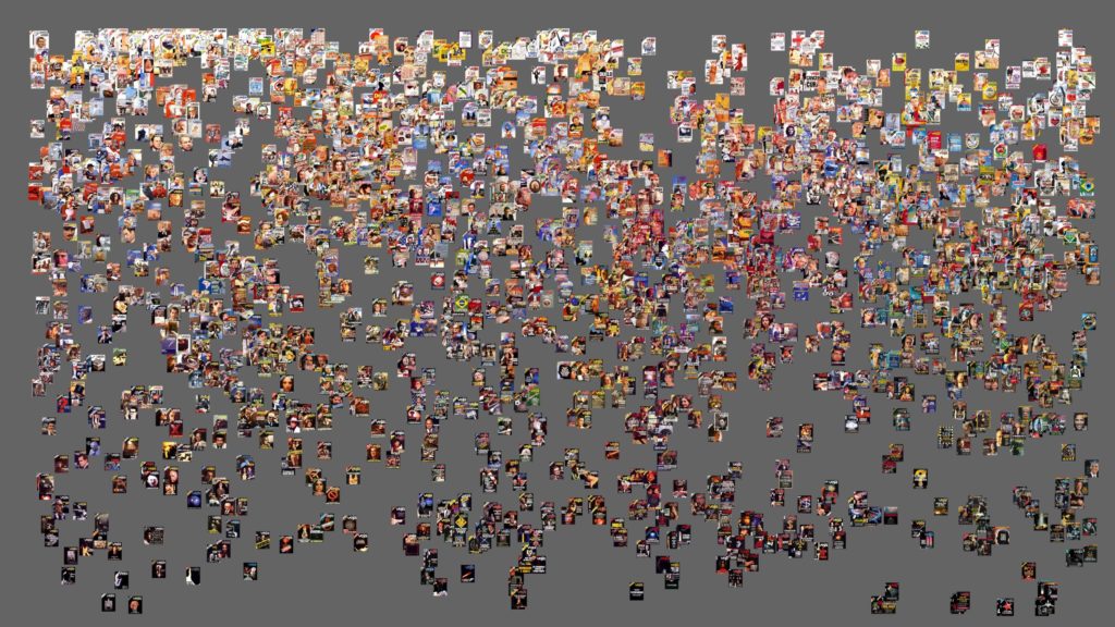
Figure 1
The creation of visual representations of information can be arranged into two basic principles: the reduction of geometric primitives through the use of spatial variables to represent key differences between them, and the data analytics that can reveal patterns and represent those relationships in a large interactive image, usually visualised on an array of tiles.
In a reductionist perspective, scientists until now were creating a whole system of representation based in bar graphs, vectors etc. to understand objects and the relations between them. The basis for this reduction, among many reasons, was due to the popularisation of the page format support. This page format forced an adaptation of visualisation systems for small formats that should be mobile and easily manipulated by the producer or the reader of the data. With the exception of maps and architectural plans, the entire information display system was being built on this reduced page format. The human need to study complex systems with large amounts of data was supplied by a strategy based on the reduction of the data, which promoted a possibility of representation of basically all the important (in a non-complex society) components in a small viewing space. In this sense the geometric primitives are taken as a point representing a specific time, and they represent a phenomenon described with a line or curve. Their behavior over time was designed using a plan map related to its development in a certain context.
Currently the computers screens still simulate the page size to establish relations with the printed page, such as A4 and Letter patterns to be viewed in its entirety during the production of written documents or graphics. This brought a stiff design interface for data visualisation in large formats, because the prevailing culture determined the size of the window to be similar of a printed page. Some fields started pushing for changes. At the cinema, the scientific field of big data computing analysis, all of them need large display formats to study and test their final products. The first available solution was to project the images on screens or flat surfaces, but these attempts only magnified the same relation to the page rather than increasing the space for the construction of a theory of visualisation. Even enlarged, the screen contains the same amount of information as a page.
According to Lev Manovich, the second principle of the visualisation is the use of spatial variables (position, shape, size and, more recently, movement) to represent major differences in the data and reveal patterns and relationships. This principle within the area of Digital Humanities could be better understood as “complex view of data” and provides an alternative methodology to the interesting field of Humanities, Media Studies and cultural institutions, because unlike the reduction perspective, it presents visual representations of real objects of visual media (images, videos) or only their parts. This direct representation helps the researcher understand the meanings and the causes behind the patterns so he can visualise in the image, as well as find additional patterns that arise in the composition of a visual map.
In this work, the discovery of patterns and elements can be shown on the visual analysis of particles that represent the construction of standards in all the covers that were analysed, and the final image shows the covers for the first time visualised in just one large image.
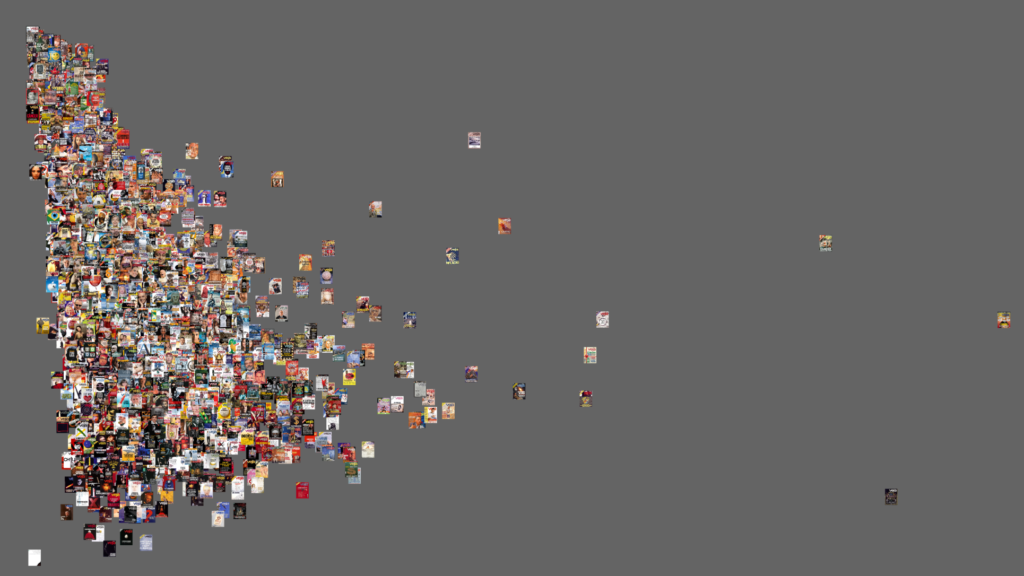
The visual result shows a kind of triangle that brings together the vast majority of the covers. However, we highlight a few covers that are beyond the standard and dramatically illustrate what we call the “complex view of data”, because the researcher can directly analyse requested elements using a “cultural algorithm” to analyse the data set of covers (Figure 2).
Figure 2
The advances that the computer graphics techniques brought to the Humanities field logically influenced the visual results of this field. This obviously can be intrinsically linked to a hybridisation of the culture generated by the software in the digital age. In the past, a major criticism against of the use of statistical or numerical representations in the area of Humanities was its possible link with a positivist view and the difficulty of representing processes that could request a more organic methodological view of some theory rather than a “simple” mechanical feature that could just show a mathematical result, i.e. a need to use more elements to transform the discrete categories used to measure cultural aspects, creating new categories of visual maps represented by curves and complex surfaces.
Some initial analyses that we performed to demonstrate what we did in our object (the entire set of covers of Veja magazine) are shown in Figure 3.
Figure 3
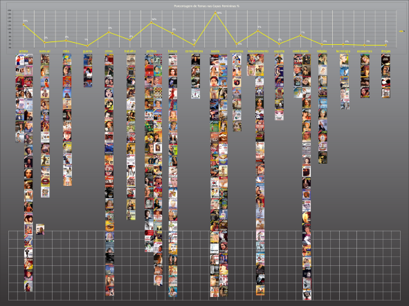
This shows an analysis of the chromatic characteristics on the set of covers of VEJA. We are trying to identify a pattern in the graphics and also to promote a different kind of view. In other terms, creating an integral visualisation of the entire collection of more than 40 years of history through covers of a magazine, with the intention to show how advanced techniques of visualisation can change the way that we see historical moments and also to show that from now on we can have at our hands the “entire scenario” of something, or in other words, that in some sense it is much more reliable to have and define a big picture of some fact. The second part of our research was the analysis of the graphics aspects under a more geographic perspective, trying to move from the very linear analyses that were established in the nineteenth century and that are still around on the academic realm, adding new visual aspects such as themes, gender and ethnic groups. Usually the results of this kind of analysis will present lines, columns and pie charts. However, what we are trying to show is that by using the data visualisation perspectives it is possible to create a more deep, comprehensive and complex way to visualise history, a system and, why not to say, “cultural algorithms” that can be created and run over big databases, allowing the user to get quantitative data and visualise the semantic questions over the entire set of covers of a magazine, such as this one that we did over the object presented in this analysis.
2. Theorising Visualisation
Lev Manovich started his Software Studies lab at UCSD in 2007 and since then he has been creating new forms of analyses of what the “software society”. In the UK we also have brand new journals on the field, such as the Computational Culture journal coordinated by Matthew Fuller and also the SoftCul Review Journal that we are editing at our university. The digital humanities is a field that is also related to Software Studies, since they share in some ways the same object, i.e. the software. But, in our field we are also concerned with the Software as a machine that can disturb, change and control certain aspects of our life.
For example, we can say that one scholar would probably take more or less 10 years to find out how many times a woman was shown on a cover of certain magazine in a country. And why this would be important for a scholar? Well, if you are a cultural studies specialist and you work with gender, this could help you to provide evidence that women do not have as important a role in society because they were not or are not being represented in an important media in a country. This is what we have decided to call “cultural algorithms”, derived from the “cultural analytics”, developed by Manovich at his Software Takes Command Book. In some ways, if a corporation such as Google decides to use its data analytics to sell goods and to control what people want to see over the internet, why not to take advantage of the same resources and use this analysis to think in terms of culture, to find out the way that a society behaves or just to change the way that they see themselves? This is what we did in a way.
Our project uses a big data analysis to show how gender is represented in Veja covers. The results are the following:
Figure 4
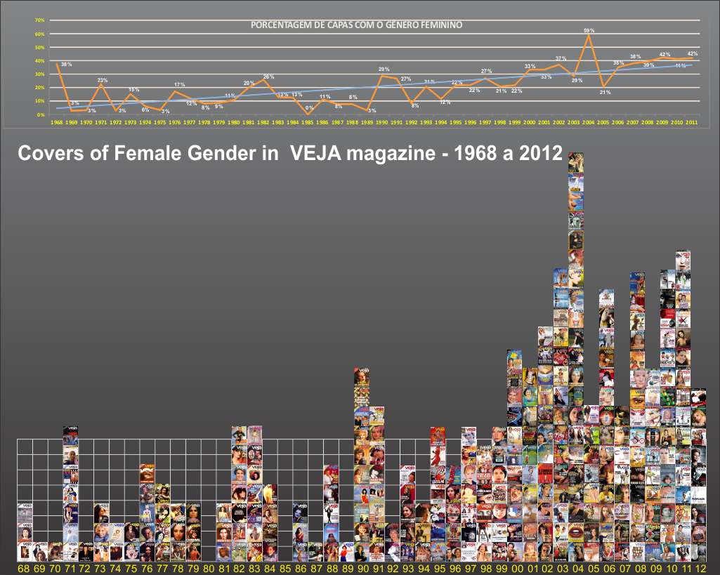
Figure 5
Despite the fact that, according to official Brazilian records, 50% of the female population declare themselves african american descendants, only 0.33% of the covers were dedicated to this sector of Brazilian society.
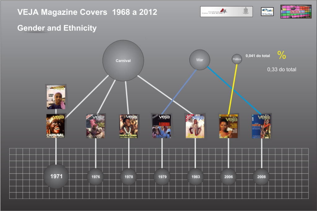
Figure 6
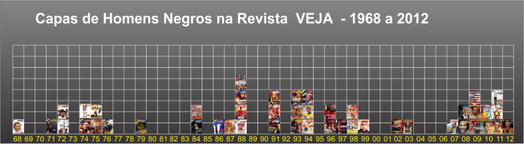
The magazine only published 2% of covers of african american males. They were focused mainly on three topics: 40% of the covers were related to sports, 11% crime and 19% politics.
3. Conclusion
Advanced techniques of Visualisation offer a new way of presenting knowledge in the digital humanities field by providing different forms of analysis of culture contents. Where we used to have a linear form to think in terms of history, we can now see an entire scenario highlighting our interest on a field of studies and demonstrating visually a point of view. This approach changes the way that visual content is seen in methodological theoretical studies. Where an image was previously seen as just an “illustration”, this image can now provide us with information that can change the way that we were thinking about something. In some ways we can say that these visualisations “think by themselves”. Another key advantage is that we can change and cross data in one day, that would take 20 to 30 years for a scholar without the help of computational resources. For example if we cross all the Veja magazine covers with the Wikipedia database using face recognition algorithms, and create a “cultural algorithm” that asks what terms were used most often on the covers during dictatorship in Brazil, we can have a “tag cloud” that can present basically all of the words that were important at that time and get, in a certain way, the zeitgeist of the moment, which would take a long time for a researcher to do using non digital humanities methodologies.
4. References
Manovich, Lev. Software takes command. San Diego: Software Studies Initiative, 2009.
Fuller, Matthew. Software Studies. Cambridge: MIT Press, 2008.
Kitchin, R. & M. Dodge. Code/Space. Cambridge: MIT Press, 2011.
Software studies initiative at Calit2 and CUNY: http://lab.softwarestudies.com/2012/06/vejavis-project-digital-humanities-2012.html