by Andrea Kocsis and Bernard Ogden
1. Introduction
The paper aims to understand how to mitigate the different types of uncertainty in crowdsourced digital history projects, using as a case study the exploration and visualisation of parts of the WWI Unit War Diaries (record series WO 95) which is one of the most popular collections held by The National Archives UK.1The National Archives digitised around 1.5 million pages of war diaries from the Unit War Diaries collection, which allowed volunteers around the world to access the diaries and participate in the crowdsourcing project, Operation War Diary (OWD).2
OWD was a collaboration between Zooniverse, the Imperial War Museum and The National Archives UK from 2014 to 2019. It involved thousands of volunteers who annotated over 150,000 pages from WO 95, containing the daily reports from the Western Front. The project resulted in a database of raw, sometimes ambiguous, annotations linked to the original documents. Part of the information revealed by the volunteers’ annotations relates to geographical locations mentioned in the diaries.
The geographical information was used as a foundation for telling the stories hidden in the dataset during the one-year fellowship that Andrea Kocsis held from 2020 – 2021.3 In collaboration with Bernard Ogden4, Andrea explored and evaluated the different types of uncertainty in crowdsourced historical data derived during the OWD project. During her fellowship, Andrea looked at the OWD data to understand the different occurrences of uncertainty during the lifespan of a project starting from the creation of documents through their annotation by volunteers, to visualisation and user interaction.
This paper, after defining the different types of uncertainty, argues that clustering may successfully help reducing the level of ambiguity in data, especially in the case of geographical points. Finally, it will explore the types of visualisations the dataset enables after the data wrangling.
2. Levels of Uncertainty in the Operation War Diary Project
The authors identified finding a balance between what MacEachren called precision and accuracy (1992) – or what Earl Babbie named reliability and validity (1975) – as the key to reducing uncertainty. Both taxonomies differentiate between those two qualities of research, which decide if the study runs methodologically correctly (precision) and/or reflects reality (accuracy). Digital methods and automation tend to imbalance the two, increasing the former at the latter’s expense. The question becomes more complex when the digital history project involves crowdsourcing, as this provides an additional step carrying the possibilities of human or technical error and misinterpretation, despite likely increasing the overall accuracy of the research by permitting greater chances for human interpretation. During Andrea’s experiments with the database, the research was focused on achieving an optimal precision/accuracy (reliability/validity) balance.
As a first step, the authors synthesised three uncertainty models (Pang 1997, a take on Fisher 1999 in Sanchez et al. 2019, and Souza 2019) which were most applicable to visualising the OWD data in order to understand what can and cannot be mitigated during data cleaning. Pang divided the encounters with uncertainty in datasets into errors during the acquisition, transformation and visualisation phases (Pang 1997). The authors also incorporated these three phases into the present theoretical framework.
Sanchez et al. reimagined Fisher’s concept of uncertainty in GIS while discussing how to manage uncertainty in visualisation. They differentiate between aleatory (statistic) and epistemic uncertainties (Sanchez et al. 2019). In the case of digital projects, the former refers to the inevitable statistical uncertainty of algorithms, while the latter encompasses all the other possible instances of uncertainty. The authors highlighted that the key characteristic of epistemic uncertainty is reducibility as new information can minimise or fully eliminate it (Sanchez et al. 2019). Therefore, the present study decided to look for epistemic errors in the OWD project to find occurrences they can mitigate.
Finally, Souza and his colleagues, after revising several uncertainty models, came up with their own graph classifying intrinsic and extrinsic uncertainties. The former consists of ontological (lacking the capacity to know what exists) and epistemic cases. The extrinsic branch focuses on the uncertainty which can happen during the interaction with the data. The theory of ontological uncertainty was borrowed to build the OWD model.
Therefore, the authors identified cases of ontological (never fully knowable), aleatory (not mitigatable but quantifiable), and epistemic (mitigatable) types of uncertainty during the acquisition, transformation and visualisation of the OWD data (Fig.1.). This paper offers ways to reduce epistemic uncertainty in geographical information during the transformation phase of the project preceding visualisation.
Figure 1. The uncertainty matrix the authors applied to the OWD data.

Seven stages were identified in the life of the OWD data (Fig. 2). While epistemic errors could happen at all stages, data transformation, including annotation, transfer, and cleaning, was the most prone to epistemic errors. One of the major data transformations in the case of the OWD project was the annotation of the archive documents by volunteers via the Zooniverse platform. The involvement of volunteers has many benefits, such as facilitating the interpretation of this vast corpus of text, but also carries the risk of epistemic uncertainty.
Figure 2. Seven stages of the OWD data.

All volunteers have a human ability to follow instructions and make sense of free-form text, and some volunteers may well have expertise in early twentieth-century palaeography and military history. Therefore their judgement may be less accurate than a professional scholar’s close reading but more accurate (and less precise) than automated text classification.
Furthermore, conflicts in annotations are unavoidable when multiple individuals are involved in extracting resources from texts. These conflicts can be resolved during the data cleaning phase. However, the resolution must be based on a balance of automation and manual data handling to provide equilibrium in accuracy and precision. In this case, conflicts were double-checked manually, with decision-making assisted by clustering. However, the authors suggest a way to bring more automation to resolve conflicting annotation by weighting the opinion of those volunteers who spent more hours on annotating. In the next section, we discuss how clustering facilitated data wrangling to resolve conflicts and correct information.
3. Clustering Place Names
Before visualisation, data wrangling was a crucial stage in transforming the data. At this stage, the authors experimented with the OWD dataset in order to test ways to mitigate the epistemic uncertainty: in this case, the errors made during the acquisition and transformation of the WO 95 data. It is more feasible to correct epistemic than ontological errors during data cleaning. For example, in the case of place names mentioned in the dataset, epistemic errors are typos, while ontological errors carry information about the note-taker’s knowledge. For instance, using “the big barn” as a location in a diary entry implies that the note taker did not understand their exact whereabouts but could use an orientation.
Clustering methods proved efficient in correcting epistemic errors connected to place names in the dataset. Clustering means algorithmically grouping closely related data items. In order to increase accuracy during the data cleaning process, the dataset was handled in a semi-automated way. OpenRefine software enabled control of the data while modifying it in bulk manually. OpenRefine is also a powerful tool for data clustering. The two main clustering methods it offers are Key Collision and Nearest Neighbour. The effectiveness and features of each method were assessed qualitatively based upon the first author’s experience of working with the data.
3.1. Key Collision – Fingerprint method
Key Collision is a partitional clustering method. It ranks parts of a string and selects the most meaningful part as a key. Based on this key, it collects the other strings carrying the same significant part. This makes it applicable to catch inconsistent formats of the same string (see OpenRefine 2020).
The authors have applied the the “Key Collision – Fingerprint” method to identify typos and mistakes made by volunteers while transcribing non-legible place names. As the Key Collision-Fingerprint method is one of the most accurate in avoiding false positives, they found that this method can be used unsupervised, making typo cleaning quicker and more accurate. It merged 450,000 rows into 26,910 different clusters and unified their format of place names. For example, the algorithm caught “sailly –Labourse”, “S’Ailly Labourse”, and “sailly la BOURSE” and merged them as “Sailly-Labourse” in its correct form.
3.2. Nearest Neighbour – Levenshtein Distance
In the second phase, the authors applied “Nearest Neighbour – Levenshtein Distance” to correct place names that note-takers or annotating volunteers misunderstood. The Nearest Neighbour method is a hierarchical clustering technique, which organises data in a hierarchical structure based on a proximity matrix of edit distances between pairs of strings (Xu – Wunsch II 2009).
As it can result in false positives (cf. OpenRefine 2020), this method requires human supervision. OpenRefine allows the user to manually modify the clusters the machine comes up with. Therefore, this method is an optimal combination of precision and accuracy, as the machine precisely looks through the big data. At the same time, the supervising historian with training in WWI history can check the accuracy, namely if the location matches the movement of the given troops.
The algorithm identified 41,964 clusters (in 450,000 rows). After filtering out the single-item clusters, only 2,951 clusters remained for the historian to check. In most cases, supervision only required accepting suggested cluster merging but sometimes the algorithm produced false positives. These included numbered locations, such as Trench 1 and Trench 2, and places with similar names like Fienvilliers and Bienvillers. The historian’s task is to identify these instances individually.
3.3. Reconciling against existing datasets
One way to automate identification is to reconcile the data against an already corrected dataset. There are multiple options for reconciliation, as it can be scripted from scratch or facilitated by various software components. The method the authors applied was based on the Witches Project by the University of Edinburgh. This project, aiming to geolocate witch trials on interactive maps, used the Wikidata plug-in in Google Sheets to retrieve the Wikidata identification number (so-called Q number) in order to identify the already registered place names (for details see Carroll 2022).
Following this approach, with the help of the Wikidata plug-in, the authors retrieved the Q numbers of place names on the list of locations as prepared by the clustering techniques discussed in the previous section. They also retrieved the latitudes and longitudes belonging to these place names from the Wikidata database. While the retrieval was automated, the historian had to manually find the remaining place names (see Hurt 2021). The process produced a list of identified and correct place names, which could be linked to the relevant records in the dataset.
4. Visualisations
After reconciling geolocations, the phase of visualisation provided further challenges. Decisions made during this phase could carry further possibilities of epistemic errors, therefore, the balance of accuracy and precision still had to be kept in mind while choosing what and how to visualise. Firstly, as not all the records could have been connected to exact locations, the extent of visible uncertainty had to be decided. Should the user be aware of the data’s uncertainties, or should the authors eliminate fuzziness from the visualisation to reinforce useability and avoid information overload? The problem also implies exploring whose responsibility – the data visualiser’s or the users’– it is to deal with uncertainty.
On the one hand, if the user should deal with uncertainty, then the visualisation must embrace fuzziness to let the user choose between possible options. The GeoBlobs project by City, University of London and The National Archives has already explored an alternative to depicting the uncertainty in place names (Liem et al. 2018, 2023). The creators of GeoBlobs took the ambiguous locations and georeferenced them in such a way that the user could slide the polygons to explore the coordinate options. While the GeoBlobs project is a fascinating alternative, the present project focused on using only cleaned coordinates to help with storytelling.
In attempts to visualise part of Operation War Diary, a method was chosen that provides an easy-to-follow storyline, has storytelling characteristics and is understandable for the wider public, not only for experts or researchers. Therefore, the visualisations do not represent uncertainty but instead use the information remaining after reducing the noise. This may have resulted in omitting data which should have been kept (false negatives), but in exchange there is a more in-depth and clear interaction between the data and the user.
After deciding to visualise only verified data, the balance between precision and accuracy had to be revisited, as the technology to map data opens a wide range of possibilities. One of the most obvious solutions was mapping clustered numeric results from the dataset, such as the numbers of prisoners or casualties. In the early stages of OWD, James Morely experimented with this type of map. The authors also created some dynamic heatmaps showing casualty statistics along a timeline on a map, allowing the user to switch between layers to follow the statistics over time. By clicking on the dots on the map, the user can reveal the information belonging to the given data point. (See examples in Nicola Hurt’s blog post.)
However, the dataset was too spotty to generate a statistically valid visualisation: despite more than 150,000 records being annotated, only about 10% of them appeared to be annotated entirely. Many annotations only provided primary information such as unit, date, time, and people mentioned. There were options to input additional secondary information, but these were annotated in a limited number of cases, restricting their statistical use. This meant that although these maps depicting statistics were technically possible – hence precise – they did not carry accurate results. This spottiness highlighted one possible volunteer working pattern of consuming more pages rather than filling in all of the required information on each page. Therefore, although it was possible to create nice-looking maps following the movement of troops with some numeric information, their information value was questionable.
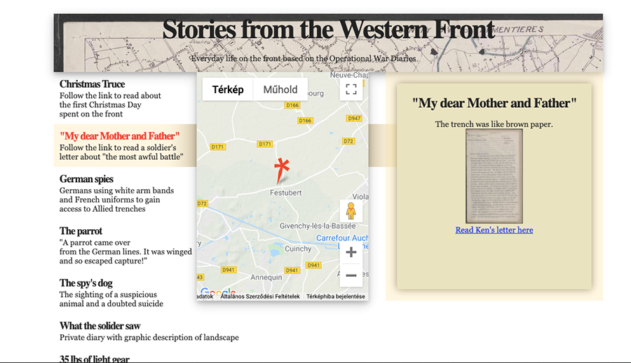
Therefore, the authors aimed to focus on individual stories instead of the big picture. The volunteers provided a wealth of exciting information when they used secondary tags. Based on this data, two prototypes were created with the help of the tags from the volunteer forum. The ‘Stories from the Western Front’ prototype follows extraordinary events on the front while bringing day-to-day life in the trenches closer to the user. For example, it shows where and how the Christmas Truce of 1914 happened, German spies disguising themselves as French allies, and British soldiers hijacking a German car full of champagne. It uses a scrolling storyboard design that links to the original documents. The user first encounters three interconnected panels: the left contains the title and a shorter event description (Fig.3). The middle shows a map, and the right displays a thumbnail of the original document and further information. The three panels are interconnected: as the user scrolls down on the left-hand panel, they move the pin on the map and display the relevant document. The user can open the full document by clicking on the document thumbnail.
Figure 3. The ‘Stories from the Western Front’ prototype.
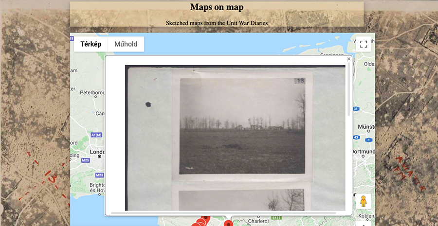
The aim of the second prototype, ‘Maps on map’, was to make the sketches and maps drawn by the soldiers, and discovered in WO 95 by OWD volunteers, browsable through a present-day map of Europe. Thus, the landscape that the WWI soldiers recorded on the Front could be compared with the current landscape. On the page, the user finds a map focused on Northern France in front of an aerial photograph background of the area. When the user zooms in, it reveals pins at specific map points. Clicking on the pins opens the sketches created at the given location in a pop-up window (Fig. 4.). These images also function as links to the original records, where the user can gain more information, and they could also enable interlinking sources from other collections.
Figure 4. The ‘Maps on map’ prototype.
5. Conclusions
This paper aimed to demonstrate how balancing precision (reliability) and accuracy (validity) can help to think about and deal with uncertainty in visualising crowdsourced digital history projects. Correcting place names in the OWD data set positively impacted further phases of the project, as it opened the way for experiments in visualisation. It also provided valuable information about the first stage of the project, the creation of the documents during the war, as it demonstrated that several note-taking soldiers had ambiguous information on where they fought exactly.
Measurement and reporting of uncertainties in both digital and manual data transformation is vital to a full understanding of a data set and conscious decision making about the balance of precision (reliability) and (accuracy) validity is important in data cleaning and presentation. These issues may often be neglected in both digital and crowdsourced projects. Thus, we expect these research results to provide valuable guidelines in understanding, controlling and balancing precision and accuracy in applying manual and automatic data handling to generate and analyse big historical data from crowdsourced digital projects.
6. Acknowledgements
This paper is an output of research funded by the Friends of the National Archives. Andrea Kocsis is a Former Friends of the National Archives Research Fellow (Advanced Digital Methods). The authors are grateful to Nicola Hurt for her work on reconciling and visualising the dataset.
© Crown copyright (2022). Licensed under the Open Government Licence v3.0.
7. References
Babbie, E.2014. The practice of social research (14th ed.). CENGAGE Learning Custom Publishing, Boston.
Carroll, E. 2023. Weeks 1 and 2 – Something Wiki’d this Way Comes. 17 June 2022. Online: https://blogs.ed.ac.uk/witchcraft_visualisation/weeks-1-and-2-something-wikid-this-way-comes/. Downloaded: 12:54 21 May 2023.
Fisher, P.F. 1999. Models of uncertainty in spatial data. Geogr. Inf. Syst. 1999, 1, 191–205.
Hurt, N. 2021. Digital scholarship in archives: A data case study. 2 September 2021. The Blog of The National Archives. Online: https://blog.nationalarchives.gov.uk/digital-scholarship-in-archives-a-data-case-study/. Downloaded: 12:33 21 May 2023.
Liem, J., Goudarouli, E., Hirschon, S., Wood, J., and Perin, C. 2018. Conveying Uncertainty in Archived War Diaries with GeoBlobs. IEEE VIS 2018 Electronic Conference Proceedings, Berlin, Germany. IEEE.
Liem,J., Slingsby, A., Goudarouli,E., Bell,M., Turkay,C., Perin, C., Wood, J. 2023. Visualising the Uncertain in Heritage Collections: Understanding, Exploring and Representing Uncertainty in the First World War British Unit War Diaries. Literary Geographies. Vol 9, No 1, 101-123.
MacEachern, A. M., B. P. Buttenfield, J. B. Campbell, D. W. DiBase, and M. Monmonier 1992. Visualization, in R. F. Abler, M. G. Marcus, and J. M. Olson (eds.), Geography’s Inner Worlds: Pervasive Themes in Contemporary American Geography, Rutgers University Press, New Brunswick.
OpenRefine, 2020, Clustering in Depth. 30 June 2021. Online: https://github.com/OpenRefine/OpenRefine/wiki/Clustering-In-Depth. Downloaded: 13:07 27 May.
Sánchez, R. T., Santos, A. B., Vicente, R. S., and Gómez, A. L. 2019. Towards an Uncertainty-Aware Visualization in the Digital Humanities. Informatics, 6(3), 31. MDPIAG.
Souza, R., Dorn, A., Piringer, B., and Wandl-Vogt, E.. 2019. Towards A Taxonomy of Uncertainties: Analysing Sources of Spatio-Temporal Uncertainty on the Example of Non-Standard German Corpora. Informatics, 6(3), 34. MDPIAG.
Pang, A.T., Wittenbrink, C.M., Lodha, S.K.1997. Approaches to Uncertainty Visualization. The Visual Computer. 13, 370–390.
Xu, R. and Wunsch II, D.C. 2009. Clustering. Wiley-IEEE Press, New Jersey.
About the Authors
Andrea Kocsis is an Assistant Professor in History and Data Science at Northeastern University London. Her research interests encompass the intersection of heritage studies and data science. Her research primarily aims to connect historical insights with contemporary technological advancements, enhancing a thorough understanding of the past and its relevance in the present context. She worked on theorising uncertainty in the Operation War Diary dataset as a Friends of the National Archives Research Fellow (Advanced Digital Methods) in 2020-21.
Bernard Ogden is a Research Software Engineer at The National Archives, where he works on various digital aspects of research projects. He is interested in the theory and practice of historical research, including questions around collaboration to bring together different kinds of expertise. He aims to look at the past through different lenses, including digital and traditional historical methods, and perspectives both from within and outside the academy.
- https://www.nationalarchives.gov.uk/firstworld-war/centenary-unit-war-diaries/
- https://blog.nationalarchives.gov.uk/operation-war-diary-archive-needs/; The OWD is now archived on the Internet Archive Wayback Machine.
- Andrea Kocsis was a Research Fellow in Advanced Digital Methods and her fellowship was funded by the Friends of The National Archives.
- Bernard Ogden is Research Software Engineer at The National Archives UK